
Rule Of Thirds
The Rule of thirds is a Compositional rule that tells peole to break an image into thirds horizontally and vertically.
This teqnique is done to ensure that everything on the webpage is aligned smoothly and allows for enough spacing to look presentable.
 Logrocket explination on Rule of thurds
This image portrays Rule of thirds. While the actual website dosen't have the horisontal and vertical Lines portayed like this image does, the lines show us exactly how the website lines up within the Rule of Three.
Hick's Law
Hicks Law is the idea that the more choices someone has, the longer it takes for someone to make a decision
The best way to combat this is to minimize how much information you show on your page.
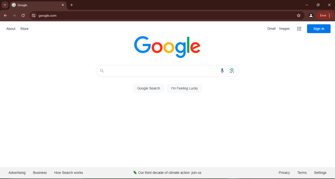 Google
This picture portrays Hicks law by showing very mimimal information to ensure that you don't draw your attention away from what the purpose of the search engine.
Even after you search something on there google search will only show you a certain numer of results. It also adds white space between the results to ensure nothing is cluttered.
Alignment
Alingment is the idea that everyting is positioned in a straight line.
While Rule of thirds allows you to have more flexibility within pannels, alingment means that all elements on a page line up almost on top of each other with white space in between.
 The Childrens Center of Austin
This image shows Alingment by following imaginary lines. The images are all the same size, sit besides each other and adds white space to balance the design out enough so we don't get overwhelmed.